
This week I attended one of my favorite trade shows, Interop, held annually in Las Vegas. It’s a great trade show dominated by the big networking companies like Cisco, HP and Dell, who wire our world and connect us to the Internet of things. It’s one of the biggest technology trade shows in North America.
As I walked the show floor, I made some observations on what works and what doesn’t in trade show marketing 2014. Some things change, some stay the same, but most surprising to me are the simple to fix mistakes many companies make. Here’s my add-up of the “good, the bad and the ugly” of Interop 2014.
The Good

Ubiquitous and innovative use of flat panel displays. This has been a trend for a while but I think has had a boost in the past year. Many booths are now designed around multiple flat panel displays and when these are used effectively, make an memorable statement. However, now usefulness of these displays depends on the content behind them. Some do it much better than others, who waste the technology.
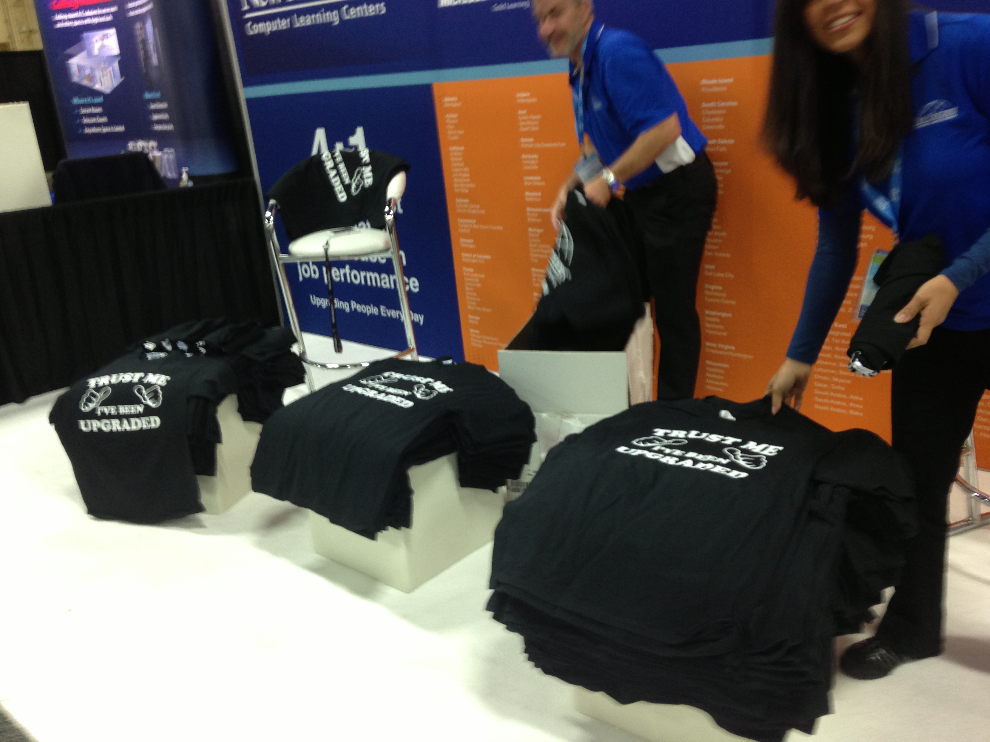
T-shirts still get the job done. As a head of marketing, I have always been amazed at what trade show attendees will do for a t-shirt. I’m also amazed at the low price of printed shirts, which seems to have dropped over the years. It all makes for a win win; the attendee gets a wearable shirt; the company gets their contact info and their ear for a few minutes.
The Bad

Too many employees in the booth Too many uniform-wearing employees in the booth can be imposing and even scare some people away. It also gives the booth a certain desperate look and frankly doesn’t enhance the brand. Plus, someone is paying all these people and they aren’t doing their normal jobs.

Irrelevant messaging. I’m always amazed that marketers at all size companies often forget some of the basic rules of messaging trade shows. The booth graphics must answer the question “what do you guys do” that permeates the show floor and starts nearly all conversations. If your booth graphics don’t address that question, don’t bother going to the show. Don’t assume (this means you Avaya) that everyone knows or cares what you do.
The Ugly

Is that your best presenter? Trade show presentations are like karaoke, just because you are willing to take the mike doesn’t mean you can sing. Technology trade shows like Interop are wrought with technical product managers who possess great knowledge about the product and very little innate ability to share that knowledge. Then someone decides they are the best person to do the booth presentation and it goes downhill from there.

Crowded booths. I don’t know if the phrase “less is more” applies, but certainly you can have too many messages, or too much “stuff” in the booth to the point that it looks like a storage closet. Clean and simple is a better goal. It’s not a garage sale; don’t let your booth look like one.
These are just a few of the images from Interop 2014 that stick out in my mind. Trade shows evolve, but they also stay the same. They are an excellent place to see how others market and to not repeat their mistakes.
What trade show trends have you noticed? Have you made some of these same mistakes?
You can connect with Eric on LinkedIn: www.linkedin.com/in/ericlundbohm/
Follow his updates on Twitter @lundbohm
